
At Aradhana, we believe that a brand is more than a logo; it’s a carefully orchestrated experience. Every digital touchpoint, from website interfaces to mobile apps, reflects your identity and builds trust with your audience. A cohesive brand style guide ensures consistency, clarity, and a lasting impression across all channels, allowing businesses to present themselves with precision and confidence. When each design choice is intentional, users feel a sense of familiarity and professionalism, which strengthens brand loyalty over time.
Defining Your Visual Identity
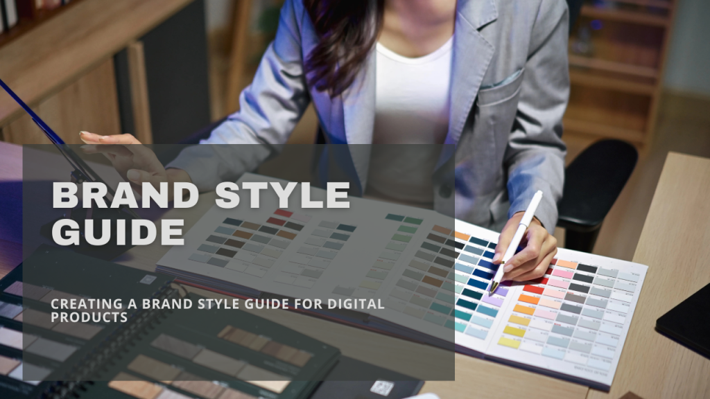
Visual identity is the foundation of any brand. It encompasses colors, typography, iconography, and imagery that together convey a consistent message. Establishing a clear color palette isn’t just about aesthetics; studies show that consistent use of color can increase brand recognition by up to 80 percent. Typography choices subtly influence readability and tone, while iconography can make navigation intuitive across platforms. Imagery selection, from product photography to illustrations, communicates emotion and values without a single word.
Bold and subtle cues can anchor a brand’s visual story without explicitly stating it. Brands that harmonize visual elements often see improved user engagement, echoing insights about cohesive digital identity. Carefully applied visual rules prevent disjointed presentations that confuse users and weaken brand recall.
Crafting a Tone of Voice
The voice of a brand is an invisible thread that ties content together. Whether a business communicates through website copy, app notifications, or social posts, the tone shapes perception. Defining formal, casual, or playful nuances ensures that users receive a unified experience. Guidelines for language, grammar, and messaging priorities prevent drift in communication, creating familiarity and trust over time.
Even slight shifts in phrasing can affect user engagement and comprehension. The subtle interplay between UX writing and brand voice shows how narrative consistency can enhance usability. Tone isn’t just words; it’s the experience of interaction, the reassurance users feel when messaging aligns with expectation, and the personality they sense behind the interface.
Component Libraries and UI Patterns
For digital products, a style guide goes beyond static visuals. Component libraries standardize buttons, forms, and navigation elements, making design and development seamless. When developers and designers work from shared resources, efficiency increases, and interfaces remain intuitive. This approach minimizes inconsistencies, allowing users to focus on content rather than deciphering varied layouts.
Small inconsistencies in interface elements can erode trust and usability over time. Design language decisions influence B2B lead quality as much as aesthetics, quietly shaping first impressions. With reusable components, updates roll out faster and interfaces feel cohesive, giving both users and teams confidence that the brand’s digital presence is polished and reliable.
Accessibility and Inclusivity
A brand that prioritizes accessibility opens doors for everyone. Incorporating high-contrast colors, scalable typography, and descriptive labels ensures users with disabilities can navigate digital products effectively. Inclusive design isn’t just ethical; it broadens audience reach and fosters positive brand sentiment. Thoughtful accessibility features also anticipate future updates and prevent costly redesigns.
Accessibility is increasingly linked with SEO performance and user retention. Designing inclusively strengthens the overall experience for all users, not just those with disabilities. For example, clear visual hierarchy benefits readers, while intuitive navigation supports users on mobile devices, aligning usability with brand values.
Documentation and Usage Guidelines
A brand style guide is only as effective as its usability. Clear documentation helps teams implement guidelines consistently across platforms. This includes instructions for logo placement, color usage, tone application, and interactive elements. Well-structured guides reduce guesswork, streamline onboarding, and support external partners in maintaining brand integrity.
Structured documentation supports collaboration across design, marketing, and development teams. Beyond basic rules, practical examples and context show how guidelines function in real scenarios. Screenshots, component breakdowns, and usage do’s and don’ts bridge the gap between theory and practice, ensuring the brand’s expression is uniform no matter who applies it.
Evolving Your Brand with Purpose
Digital products are not static, and neither should your brand guidelines be. Regular audits and updates allow adaptation to evolving user expectations and technology trends. Flexibility within a structured system ensures the brand remains recognizable while embracing innovation. A living style guide becomes a strategic tool, guiding creativity without sacrificing consistency.
Iteration is as much a design principle as it is a business strategy. Monitoring how users respond to visual and verbal elements can inform adjustments that keep the brand relevant and approachable. Staying adaptive while anchored in core principles ensures every touchpoint strengthens identity rather than diluting it.
A thoughtful brand style guide transforms scattered elements into a cohesive experience. At Aradhana, we help organizations craft digital identities that resonate, ensuring every interaction communicates reliability, clarity, and vision. With a consistent framework, businesses can scale confidently, delivering memorable experiences that leave a lasting impression and make users feel truly understood.


